As of September 2026, Sentinel is on pace to log its highest revenue year in company history.
Correlation, not causation. Sentinel is a business with a real product, real fabrication capacity, years of brand equity, loyal customers, real category demand, and real operational leadership. The revenue growth belongs to the business. What we can say plainly is that during the engagement window, Sentinel’s site was rebuilt on modern infrastructure, redesigned around the sales data the site itself generated, and the business’s revenue trajectory during that window is the strongest in the data available to us.
This case study is about how that rebuild happened: a Hydrogen storefront redesigned around how customers actually buy custom mouth guards, and the pricing and positioning work that preceded it.
Who Sentinel is
Sentinel Mouthguards LLC is a custom mouth guard manufacturer. The brand serves people who face teeth grinding and clenching, tongue and cheek biting, athletes needing sports protection, and orthodontic retainer replacements. Every finished guard requires a dental impression on file, either uploaded as a digital scan (STL file) or produced by the customer using an impression kit Sentinel ships with the order.
Sentinel does the fabrication in-house. The founder is the lead dental technician, and the finishing team hand-trims, shapes, and polishes every guard to the specific contour of the customer’s bite.
The storefront has to earn that story on-page, because online buyers in the category cannot see the lab in person, cannot meet the technicians, and cannot inspect the finished product before it ships.
What we rebuilt
What the first Hydrogen build left open
Sentinel moved from WooCommerce to a custom Hydrogen storefront in late 2024. That build solved the platform problem: faster page loads, cleaner checkout, mobile parity with the desktop experience, a working product catalog and quiz.
It did not solve the decision problem. A customer arriving at the site still had to figure out on their own whether they were a Comfort Guard buyer or a Hybrid Guard buyer, whether they needed 2mm or 3mm, whether their grinding was mild or heavy. The homepage opened with a lifestyle photograph and a general collection CTA for night guards. The product listing showed four night guards side by side with dense technical specifications. The cart flow captured impression preference with a single checkbox that was easy to miss. The quiz asked five general questions and produced a recommendation.
All of that worked, but none of it removed the friction of custom-product decision-making from the buyer.
The sales data was clear enough to point at a different design. Certain guards outsold others by a wide margin. Certain option combinations barely sold at all. Buyers were being handed the “which guard is right for me” decision when in reality they wanted to be told which guard was right for them. Different thicknesses added another decision the customer had to make. The information the site was already generating pointed to a specific rebuild.
The data informed pricing and positioning
The first thing we did was pull the sales data and study it. Which guards actually sold. Which options within those guards were selected. Which price points converted at which volume. Which product variants generated returns or fit issues. We also identified data the site should be capturing but wasn’t (for example, which quiz answers led to which purchases), and scoped that for the rebuild.
Two decisions came out of that analysis before a single screen was redrawn.
The product option set was simplified. Options that historically sold at low volume were removed from the primary flow, so buyers were making fewer decisions between arriving on a PDP and checking out. Cognitive load is a conversion tax, and the sales data showed which options were paying the tax without earning the revenue.
The pricing structure was re-anchored based on the numbers. Guard prices were rebuilt against unit fabrication cost, customer acquisition cost, repeat purchase rates, and impression redo rates. The pricing conversation moved from “what does the market charge for a custom night guard” to “what does each Sentinel guard cost to make, deliver, and support, and what does it deserve to earn.” That analysis produced the current night guard price ladder: $165 Comfort, $190 Hybrid, $215 Hard, $235 Durability, alongside the $180 No-Show Day Guard.
Those decisions were implemented before the new site launched. The redesign that followed was designed to give those new anchors a story: to position Sentinel not against the market’s cheapest custom guards, but against dental-office pricing for the equivalent work.
That reframing runs through the current site. Every guard carries the Sentinel Promise (100-Night Outcome Guarantee, Three-Attempt Fit Resolution, 1-Year Craftsmanship Warranty, Real Humans Real Help). The About section positions the founder’s clinical background and the in-house lab as the defensible ground. The PDPs anchor guard pricing against dental-office pricing rather than against discount D2C competitors. The tonal register shifted from promotional D2C (“SAVE 15% SITEWIDE,” “Stop Grinding Now”) to clinical authority (“Perfect fit or we remake it free,” “Wake up without the wear and tear”). The redesign didn’t only change the site’s structure. It changed the register the brand speaks in.
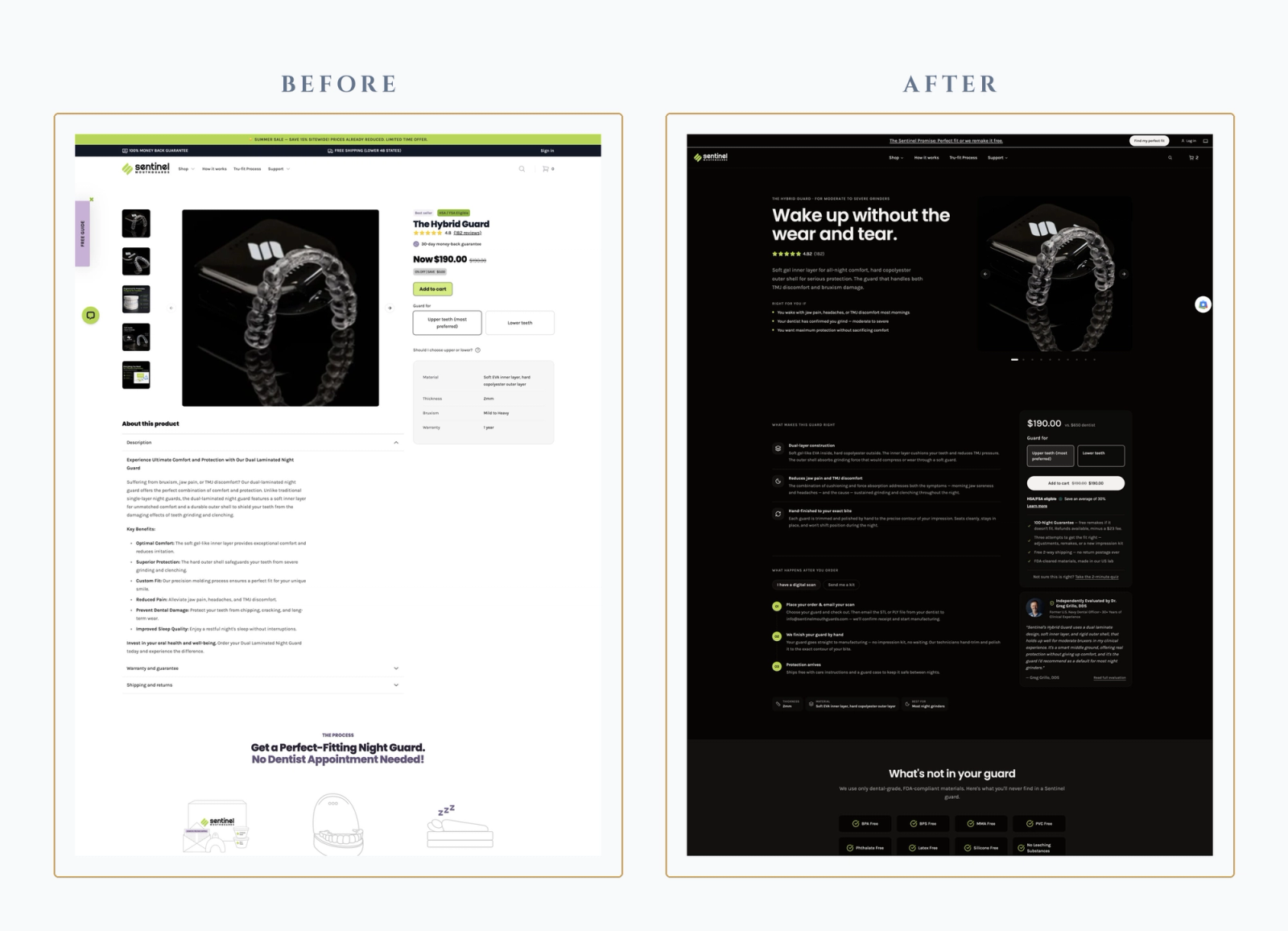
Fewer product variants, cleaner price anchors, premium positioning. Those constraints set the shape of the storefront rebuild. The redesign had to make the smaller catalog easier to move through for buyers who did not know which product they needed, and it had to carry the tonal register the pricing work established.
The symptom-first homepage
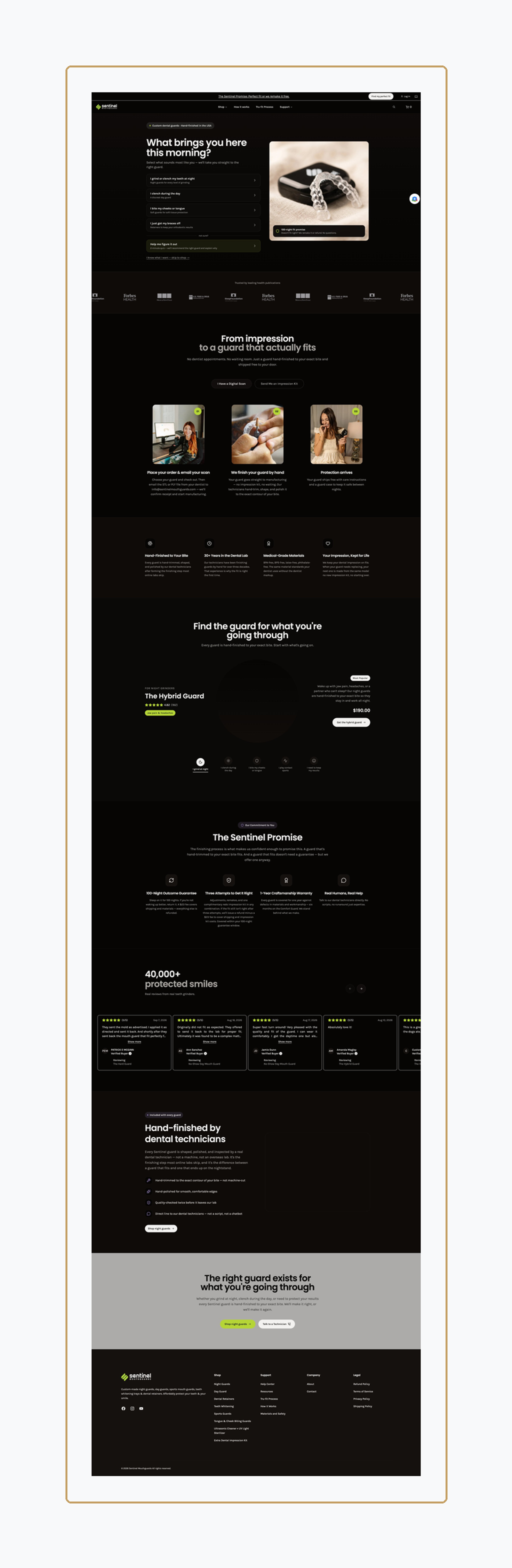
The homepage no longer opens with a category grid or a lifestyle photograph. It opens with a single question:
What brings you here [time of day] (ex. this morning)? Below it, five options match how customers actually describe their situation to themselves. I grind or clench my teeth at night. I clench during the day. I bite my cheeks or tongue. I just got my braces off. Help me figure it out. Each option routes directly to the correct product or to the diagnostic quiz. Buyers who already know what they want can bypass the funnel with a small “I know what I want” link that goes straight to the shop.
The homepage below the fold carries the trust architecture the category demands: press mentions, the three-step process from impression to finished guard, the Sentinel Promise, the reviews carousel with verified-buyer badges, and the closing hand-finishing section that positions dental-technician finishing as the difference between a guard that fits and a guard that gets set aside.
Guided collection with severity comparison
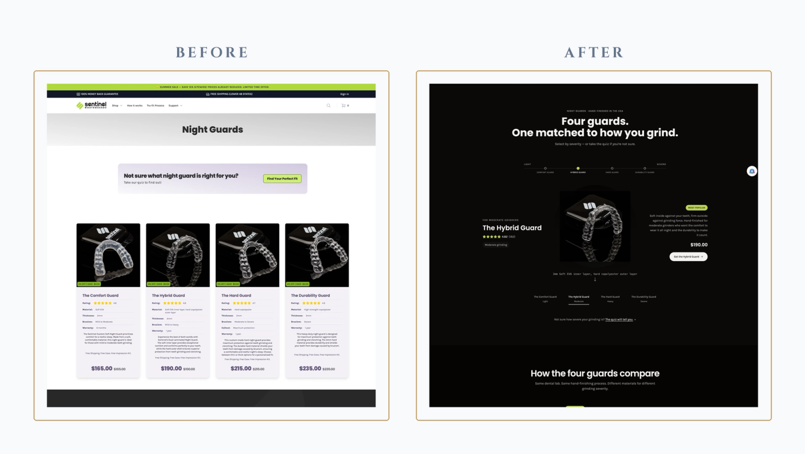
The night guard collection page carries a comparison table showing all four guards on a single row: Comfort ($165), Hybrid ($190), Hard ($215), Durability ($235). The row anchors on grinding severity (Light, Moderate, Heavy, Severe), material composition, thickness, and best-for description. Above the table, a severity slider lets the buyer select their range, and the featured product card updates dynamically to match. Below the table, the trust architecture continues into the 3-step process, materials safety block, reviews, and Sentinel Promise.
The comparison table is the decision aid the old collection did not have. The previous collection listed each guard independently, with dense technical descriptions that added cognitive load rather than reducing it.
Structured add-to-cart data capture
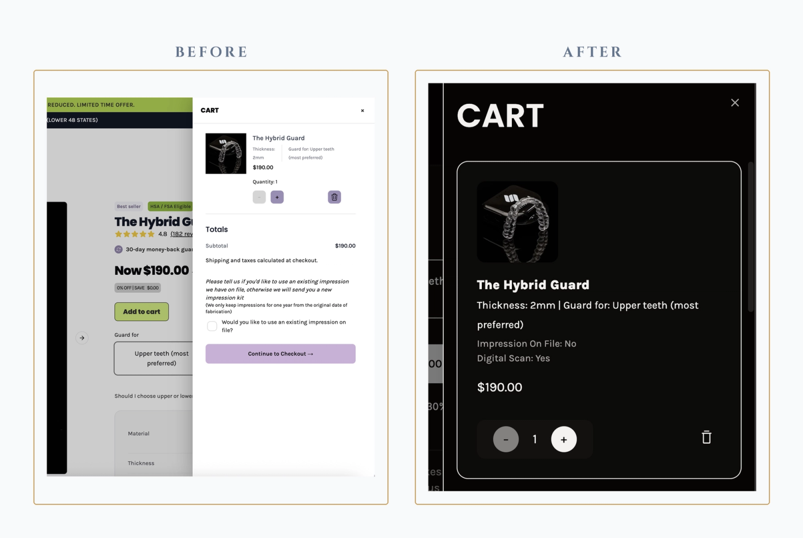
This is the redesign’s most operationally consequential change. In the earlier build, impression-on-file preference was a checkbox in the cart sidebar labeled “Would you like to use an existing impression on file?” It was a single toggle, easy to miss, and captured nothing else. Fulfillment could not tell from the order alone whether the buyer had a digital scan they intended to send, whether the guard was for someone other than the account holder, or what to expect in the impression workflow.
The redesigned flow replaces the checkbox with a three-question modal sequence that runs before the cart opens. (1) Do you have an impression on file? (2) Do you have a digital scan? (with a callout of accepted STL formats). (3) Who is this guard for, and if it’s for someone else, what’s their name? The captured data then renders on the cart line item: Impression On File: No, Digital Scan: Yes, alongside the standard thickness and guard-for (upper or lower teeth) attributes.
Fulfillment gets the data it needs at the point of purchase, not through follow-up emails after the sale.
The recipient-name capture also solves a records-management problem the previous flow created. When one account holder ordered guards for a spouse, a child, or a parent, all of those impressions accumulated under a single account name, and the lab had to work out which impression belonged to which recipient after the fact. Capturing the recipient’s name at purchase keeps each dental record attached to the right person from the start.
The dynamic quiz
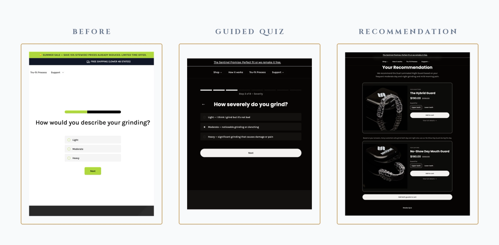
The quiz went from five general questions to eight named-category steps: Timing, Frequency, Severity, Awareness, Pain, Triggers, Experience, Preference. Each step shows the buyer where they are in the sequence (Step X of 8) and what the step is measuring, which reduces the “how many more of these are there” abandonment pattern.
The recommendation page changed materially. Where the old quiz returned a single night guard, the new version returns a primary recommendation and, for buyers whose answers indicate both day and night grinding, a paired cross-sell to the No-Show Day Mouth Guard with an Add Both Guards to Cart option. That expansion was a data call. The Day Guard produced more revenue than some of the night guards, but the recommendation logic had been ignoring it entirely. Both products carry the guard-for (upper or lower teeth) toggle at the recommendation stage so the buyer can move to checkout without a second decision layer.
Operational impact
The redesign changed the shape of what happens after a buyer clicks Add to Cart. Order metadata that used to live in follow-up emails, support tickets, or the fulfillment team’s inference is now captured on the order itself. A cart line reading Thickness: 2mm | Guard for: Upper teeth (most preferred) | Impression On File: No | Digital Scan: Yes tells the lab team, before the order is even fulfilled, what workflow the order needs. Impression kits ship automatically to buyers without an on-file impression. Digital scan uploads route through a defined process. Guards ordered for a recipient other than the account holder carry the recipient’s name on the order, so the lab labels the impression kit correctly on the first attempt.
The operational value of this compounds. Every point where the site captures information at purchase is a point where the fulfillment team is not chasing information after purchase, and every redo prevented is a repeat-purchase relationship preserved.
Results
The site itself is measurably fast and technically sound. Real user monitoring shows P90 Interaction to Next Paint of 93ms, Largest Contentful Paint of 1.23s, First Contentful Paint of 1.07s, and Cumulative Layout Shift of 0.00. All four are within the “good” thresholds defined by Google’s Core Web Vitals. Lighthouse audits confirm 100 SEO, 97 Accessibility, and 96 Best Practices. Those numbers are the technical baseline the design decisions above are built on.
Why this matters for custom-product manufacturers
Custom consumer products carry an operational shape transactional ecommerce doesn’t. Every order for Sentinel sits inside a longer process: an impression to capture, fabrication to schedule, a fit outcome that isn’t confirmed until the buyer has worn the product for a few nights, a lifecycle that runs from delivery through wear-out to replacement. The storefront serves only the front of that process. The rest lives beneath the storefront: how the impression moves through the lab, how a fit issue gets triaged, how a customer record holds together across a year of touchpoints. Off-the-shelf Shopify often doesn’t serve these business-specific operational models.
Custom manufacturers need front-end experiences designed for their category and back-end infrastructure designed for how their operations actually work. Headless is what makes the storefront layer buildable without the compromises off-the-shelf themes force. The rest is systems work grounded in the reality of the business.
Why Frame & Ledger for custom manufacturers
Frame & Ledger builds foundational Shopify infrastructure for custom manufacturers: the storefronts, the proprietary applications that make custom operations run on Shopify, and the integration and data architecture that lets a catalog-shaped platform serve a workflow-shaped business. The work is systems work, not marketing work, and the goal is the operational layer that turns a real product and a real team into a business that runs at scale.
We are the right firm for businesses with real product depth, real fulfillment complexity, and a need for the operational infrastructure to carry them from where they are to where they intend to go.
Measure twice. Scale once.
Core Web Vitals sourced from field-level real user monitoring. Lighthouse audits captured on the current site homepage under mobile emulation with slow 4G throttling.